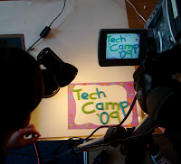
For all its wires and wizardry, PCI’s Tech Camp forces me (and probably the other leaders too) to annually re-evaluate what it is I’d like the campers to go home having experienced, learnt and understood. And this morning’s conversation with William Crawley and Simon Jenkins on Sunday Sequence (starts after 1 minute 15 seconds), further distilled my thinking.
Personal skilling is one thing. But the idea of weighing down their congregations with new ideas and possibilities is sometimes frightening! What if fourteen campers all ended up voxpopping, making videoing, animating, blogging and ringing out their PA systems to eliminate feedback in each of their congregations? There’d be pandemonium, angry letters and frustrated parishioners.
While everything is possible, not everything is desirable.
- If a PA system howls every time someone speaks, it’s worse than useless.
- If the words and images up on the screen at the front are distracting, then they’re getting in the way of the message.
- If a church website can’t tell you the street address and postcode of the building, then all the video and images in the world won’t make it useful to a visitor. (Some thoughts on church websites in a post last year.)
Which brings me to the point of the post.
Despite being a natural technophile, I probably advocate a very conservative minimalist approach to the use of technology in churches.
Success is when it’s there but not noticed. When the PA just works, allows you to hear the voices and instruments that you need to when you need to and doesn’t go wrong in a way that you notice.
And when it comes to screens … projected lyrics need to be as consistent and reliable as a paper hymnbook. By the time your tongue is curling around the last syllable of a verse, your eye has moved to the beginning of the next verse ... and that’s the point you need to change slide. And when it comes to illustrating sermons and talks, less is more. One picture. Perhaps no words.
The trick is to master technology, rather than become its slave.
In a hastily concocted analogy this morning, I suggested that a joiner doesn’t always use a hammer. He has a toolbox full of tools, and uses the most appropriate one, often the most subtle. And so it should be with technology. Unless you want the medium to take over the message, go easy.
Go minimalist.
Update - great article about PowerPoint over on BBC News website. It discusses the pitfall of slides being "verbal crutches for the speaker, not visual aids for the audience" as well as the problem of bullet points.
No comments:
Post a Comment